MASON W POJE
Thesis Project
This page details the story of the brand's identity development
The client problem:
Engrain Play Co., a wooden toy manufacturer based in Madison, Wisconsin, was ready to scale its brand to a national audience. The primary goal is to gain revenue by successfully addressing a lack of clear brand identity, creating an engagement strategy to reach parents and caretakers who value creativity, learning, and open-ended play.
The Solution:
The company needed a cohesive, research-based brand system that communicates its values and stands out in a saturated toy market. The Engrain Play Co. brand identity was developed through an iterative design process backed by research and focused on solving the client problem by creating the necessary branding and media elements.
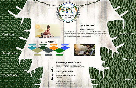
Onlyness Statement
This statement served as the starting point for all brand decisions, clarifying the target market, niche, benefits, and features. It helped ensure that every visual and written asset supported the company’s message of stimulating growth through imaginative play.
"Engrain Play Co. is the only wooden toy manufacturer in Madison, Wisconsin that stimulates curiosity and fosters a lifelong love of exploration in children under 10 through unplugged adventures with thoughtfully crafted, ecofriendly, modular pieces that can be rearranged to create narratives for years."

voice and tone
The brand's voice is playful, sincere, and curious. It avoids overly technical or trendy language in favor of messaging that feels warm, imaginative, and grounded. Based on marketing research (Green, 2025), the voice had to appeal to both children and adults. While children are drawn to imaginative visuals and phrases, adults need to trust that the product provides real value. The voice was refined to reflect that dual appeal: playful for kids, practical for parents.
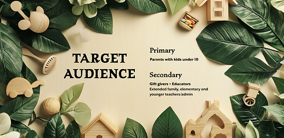
target audience
The target audience directly impacted the marketing strategy, and the voice and tone of all material produced.
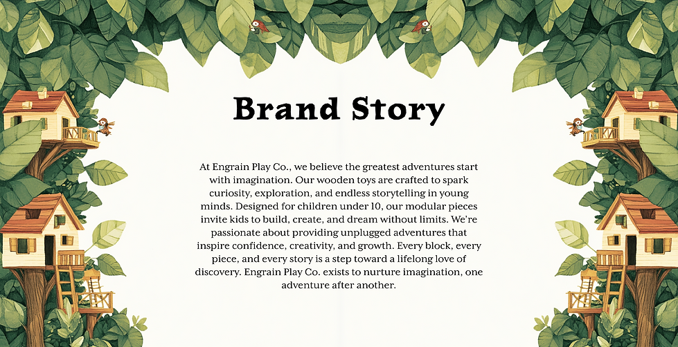
Brand story
The brand story was carefully crafted and worded to balance an exciting message to kids and an important benefit to parents.
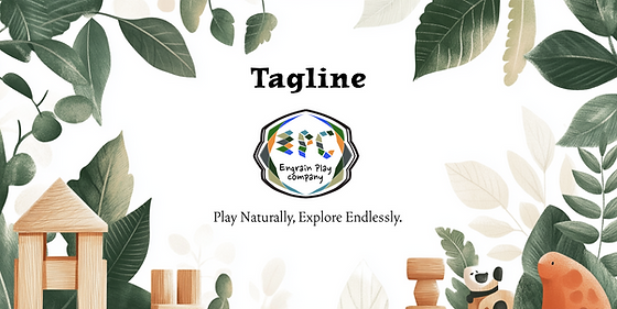
Tagline
After many options were tested for potential taglines, a unique phrase that represented the main ideals of the brand were selected as the slogan.
Look and feel
Color:
The palette of colors used in the brand identity were strategically sampled from a jungle treehouse scene, then modified slightly to fit a split complimentary scheme. The effectiveness of split complementary color schemes lies in their ability to offer visual interest and variety without overwhelming the viewer. According to Etchr Lab, this color strategy “creates a strong visual contrast with less tension and more variety,” making it ideal for designs intended to be both stimulating and harmonious (Wauson 2021).

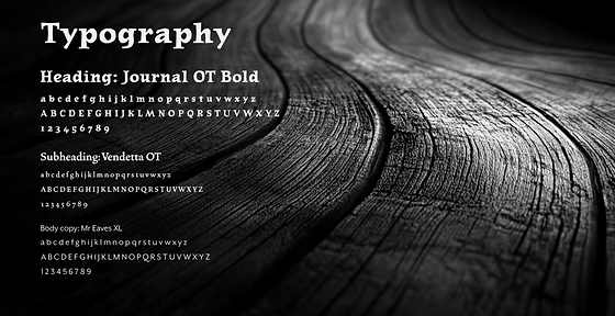
Type:
All the fonts for Engrain Play Co. come from the Émigré foundry to keep the brand consistent. Choosing typefaces from a single foundry is a strategy used to ensure all typefaces share visual DNA, keeping the brand cohesive and clean (Heck, 2015). Journal OT Bold is used for headings because it feels adventurous, like something you’d see in an old explorer’s notebook. Vendetta OT Bold works well for subheadings—it’s strong and classic, which gives the brand a timeless feel. For body text, Mr Eaves XL Sans is clean and easy to read, which helps everything stay clear and approachable. Together, they match the jungle treehouse theme by being playful but still professional.
Line & Shape:
For the line and shape elements, a combination of geometric patterns and abstract foliage shapes were used. This blend reflects the structured yet organic nature of our toys. Geometric patterns provide a sense of order and familiarity, while abstract foliage introduces a touch of nature and creativity. This combination enhances the visual interest and supports our brand’s message of imaginative, nature-inspired play.

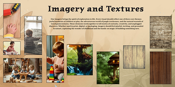
Textures and Imagery:
The texture and imagery for Engrain Play Co. are closely tied to the brand’s theme and name. The use of wood grain not only reflects the natural material used in the toys, but also connects directly to the word “Engrain,” symbolizing how early play experiences become deeply rooted in a child’s development. Treehouses and jungle elements were used throughout to create a narrative world that invites exploration. This ties into the psychology of adventurous play (Hogenboom, 2022), reinforcing the value of encouraging curiosity and resilience.
Brand vision board
The vision board set the visual tone for the entire brand. It combined three major imagery categories: children playing with toys, natural wood textures, and the jungle treehouse theme. This board served as a visual compass, ensuring that all brand visuals stayed consistent from colors to type to imagery and patterns. It laid out a working onlyness statement which established a voice and tone, connecting imagery to intent (Bakhtiari, 2020).
Logo development
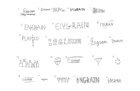
Ideation:
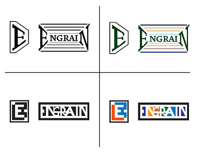
Following an exploration into existing toy companies, ideation began. Starting with quick hand sketches, the goal was to express the word "engrain" in a unique and compelling way. At this point, the focus was not to polish any into final solutions, but rather to create a montage of many directions. Dozens of initial sketches were explored, ranging from abstract to literal. Early drafts emphasized either nature, construction, or childhood.
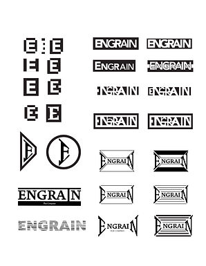
Vectors:
The next step was to take the more effective concepts and test them out in vector form. When moving from sketches to vector graphics, it’s important to start in black and white (Airey & Carson, 2021). This helps focus on the core shape and structure of the design without getting distracted by color. Working in grayscale makes it easier to test clarity, balance, and scalability early on. Once the form is strong on its own, color can be added more intentionally to support the overall brand message.
Preliminary Concept:
To move forward with creating media assets, the logo chosen used an illusion of negative space to spell out "engrain". This logo was deemed effective because of the impression of building blocks, with the name literally ingrained into whitespace. Both the color palette and shapes express the creative ideals of the company.
Refinement:
Feedback revealed the original logo wasn’t obviously legible at small sizes, especially for mobile devices. This led to testing a more circular shape with cleaner lines and bolder contrast. Text was added to improve clarity.
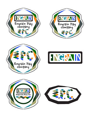
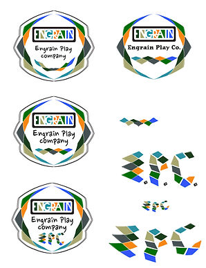
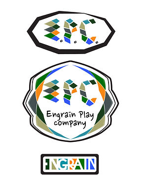
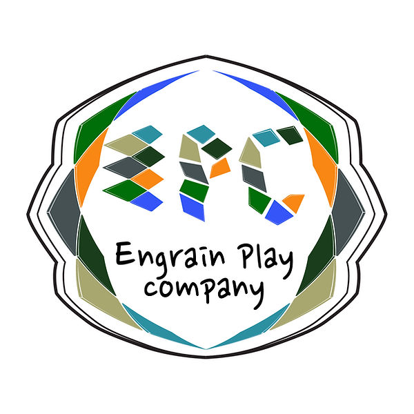
Final Solution:
The final logo included simplified, bold shapes comprising initials instead of full words for better visibility. The color palette from the style guide were used to tie the logo into the full brand system.
Evidence of Success:
Based on industry standards (Alonso, 2024), simple, high-contrast logos perform better in small-scale applications, like social media profiles and mobile screens. The inference of a head shape shows the concept of stimulation, the varied polygons show the process of building, and the script font is playful yet legible.
Brand media assets
Various media assets were created for the brand in order to reveal practical applications for both visual concepts as well as the voice and tone. In a few weeks, following a strict production schedule, assets were created and mocked up for a stationary package, a portrait and landscape billboard, logo animation, social media profiles, and a 30 second audio ad.
The billboard and print handouts leaned into color and imagery to draw attention, while the radio ad relied on tone and storytelling, connecting back to the brand narrative (Alonso, 2024). Every asset was modified in retrospect to display the new logo. Each asset used elements from the style guide and followed the look and feel established from the vision board.
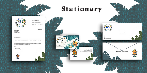
StationEry
The stationery set for Engrain Play Co. was designed to feel both professional and playful, while still staying aligned with the brand’s identity.
The letterhead uses a clean layout with minimal distractions, but includes branded elements like the geometric foliage and house icon to bring in personality without overwhelming the message.
The business card leans more expressive, using a colorful jungle illustration on the front and simple contact info on the back, which helps strike a balance between creativity and clarity.
The envelope design carries over the foliage textures and iconography, tying everything together with subtle consistency. The brand’s tagline is featured on the back to reinforce the mission even before it’s opened.
Getting to this point involved testing several layout options and dialing in how much visual detail was appropriate for each format. In the end, all three use similar graphic accents that act cohesive as a system.
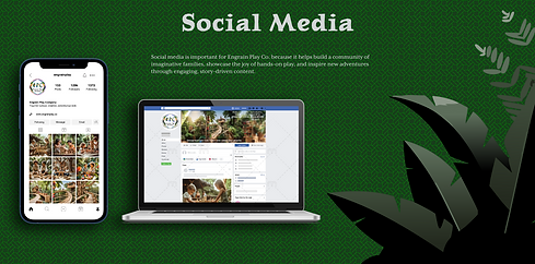
Social Media Profiles
The social media mockups focused on creating profiles that felt on-brand and easy to recognize, especially on mobile. The original logo was too detailed and hard to read on smaller screens, so it was swapped out for the new, simplified version that holds up better at smaller sizes. Instagram and Facebook were chosen as the top two platforms based on research showing that most parents in the toy market rely on those channels when discovering and evaluating brands (Williams, 2024). The previous billboard design was repurposed for the Facebook banner to keep things consistent across touchpoints. For Instagram, the bio reads “toys for curious, creative, adventurous kids,” which was inspired by looking at similar brands and finding something short, friendly, and clear. Most of the posts feature kids playing with toys in jungle-like settings to match the brand’s playful and imaginative tone.
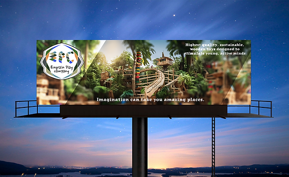
Billboard
This billboard works well because it grabs attention quickly and clearly shows what the brand is about. The logo is placed prominently in the top left corner, which helps with recognition and ties in nicely with the wooden, geometric feel of the brand. The background image of a jungle treehouse creates a sense of wonder and imagination, which supports the idea that play can take kids to amazing places. The messaging is short, easy to read, and speaks directly to both parents and kids. The tagline at the top highlights quality, sustainability, and mental stimulation, while the line at the bottom adds an emotional touch. Altogether, it feels playful, clean, and consistent with the Engrain brand.
Radio Ad
Just like the stationary design balanced clean structure with playful elements, the radio ad was built to carry that same energy through sound. I chose to do a radio ad for a few reasons. Without visuals, the listener has to imagine the world for themselves—just like how kids create their own adventures during open-ended play. It’s also a great way to reach busy parents during their daily routine, whether they’re driving or multitasking. With the right mix of storytelling and sound effects, the ad brings the spirit of exploration to life in a way that feels simple, fun, and on-brand.
Animated Logo
The animated logo was developed with a focus on practicality and real-world application. Previous iterations were visually engaging and reflective of the brand, but their extended duration limited their usability across common media formats. Research and observation indicated that animated logos are most frequently used at the end of commercials or short-form video content. Based on this insight, the final animation was designed to begin and end on a white frame and to complete its full cycle in ten seconds or less, ensuring it aligns with standard industry practices for motion branding (Yalanska, 2018).

References
Airey, D & Carson, N. (2022, December 6). 10 golden rules for nailing your logo design, straight from the pros. Creative Bloq. https://www.creativebloq.com/graphic-design/pro-guide-logo-design-21221
Alonso, M. (2024, August 5). Forbes Communications Council. The power of storytelling in modern marketing. Forbes. https://www.forbes.com/councils/forbescommunicationscouncil/2024/08/05/the-power-of-storytelling-in-modern-marketing/
Bakhtiari, B. (2020, November 17). How to create a brand vision board. B is for Bonnie Design. https://bisforbonniedesign.com/2020/11/how-to-create-a-brand-vision-board/
Busy Bees. (2021, March 31). The benefits of using natural resources in children's play. https://www.busybees.edu.au/the-benefits-of-using-natural-resources-in-childrens-play/
Ginsburg, K. R. (2007). The importance of play in promoting healthy child development and maintaining strong parent-child bonds. Pediatrics, 119(1), 182-191. https://doi.org/10.1542/peds.2006-2697
Green, W. (2025). Marketing Made Clear. Advertising to children. https://marketingmadeclear.com/targeting-children-with-marketing/Heck, B. (2015). The value of multi-typeface design. Medium. https://medium.com/s/about-face/the-value-of-multi-typeface-design-ccd67227b0ee
Hogenboom, M. (2022). The benefits of adventurous play. Substack. https://melissahogenboom.substack.com/p/the-benefits-of-adventurous-play
Kramer, L. (2022, November 15). Color meanings and the art of using color symbolism. 99designs. https://99designs.com/blog/tips/color-meanings/
Wauson, K. (2021, May 11). Simplifying Color Choice with Split Complementary Color Schemes. Etchr Lab. https://etchrlab.com/blogs/news/split-complementary-color-schemes
Williams, L. (2024, April 10). Swipe, Click, Buy: How Social Media Shapes Parental Decisions. JPL. https://jpl.agency/news/how-social-media-shapes-parental-decisions/
Yalanska, M. (2018, November 21). Animated Logos: Why, Where and How to Use. Design4Users. https://design4users.com/animated-logos-why-where-how-to-use/