MASON W POJE
collaboration
This page details both the peer feedback and self assessments made throughout this thesis project. All feedback was considered and adjustments were made accordingly.
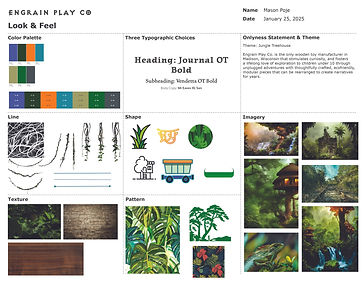
Style Guide title page
Feedback Received
�
Graphic background does not have the intended effect. Originally crafted to use geometric patterns within the color scheme to show a leafy pattern, instead has the inverse shape being more visually dominant.

Feedback Evaluation
The visual still has a overall effective look, and might depend on the viewer. However, the whole idea to make it appear as if the viewer is peering at the page through jungle foliage was entirely lost in the initial version. If the textured pattern displays as the bottom layer of a background, the negative space will be viewed as its own shape.
Actions Taken
Several minor tweaks were applied in order to address this feedback. First of all, the graphics were traced and replicated to become their own shapes – this allowed for cleaner edges and the ability to add effects. The original backgrounds were applied with clipping masks and laid out symmetrically, with both sides copied, reflected, offset slightly, and placed directly below the conversing side. Finally, a drop shadow was added to bring the leafy shape to the forefront, creating the desired effect.

logo interpretation
Feedback Received
Do to the somewhat abstract nature, the logo also needs to include clear, legible, text of the brand name.

Feedback Evaluation
For someone seeing the brand for the first time, the first concept takes some interpreting. Looking at numerous real world logos, the majority of abstract logos also include the brand name in plain text. This feedback is valid and additional refinements will be made.
Actions Taken
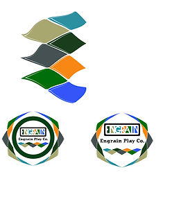
Various compositions were explored in modifying the existing logo to incorporate the plain text– expanding the border to add more space, placing the text above, below, or within. Ultimately, there was no option that worked great, and a full redesign was required.

Logo designed for socials
Feedback Received
When looking at the brand application in mock social media pages, the logo worked well on larger screens but was illegible at a smaller scale.

Feedback Evaluation
Considering the large and growing percentage of people viewing social media pages on phones compared to computers, a much smaller profile picture should also be taken into consideration. Something that is shortened, less intricate, has higher contrast might work better.

Actions Taken
The first consideration was making a logo that had a somewhat circular shape. This allowed the logo to be displayed at full size within the constraints of the profile picture circle, without having to be shrunk to fit. The solution uses a playful but legible font, that takes up much more space than before. Also the prominent graphic is larger by shortening to just the initials rather than the full word. By sticking with the identifiable color palette, the audience will be able to quickly see the identity of the page.


Theme selection
Feedback Received
The initial theme moving forward for the brand is vague and needs to be narrowed down. "Discovery and exploration" is broad and not necessarily a theme that will benefit the rest of the brand development.
Feedback Evaluation
At this point in the project, a theme seemed like an abstract idea to select. Trust was key in the expertise of the feedback. Having seen some previous projects, finding a more specific theme along the same category was decided to pursue.
Actions Taken
Starting with "discovery and exploration", many subcategories were brainstormed. There were many valid options, but ultimately "a jungle treehouse" theme was settled on, and applied through the rest of the project.


Feedback Received
The logo animation needs to be much shorter. The existing animation is long and drawn out, therefore lacking excitement and appeal.

logo animation

Actions Taken
Both a three and a ten second variation of an animated logo were created. Now having multiple versions of different lengths allows future publications to choose which animation fits that specific application. To standardize the brand look, the three second variation should be primarily used on all video signoffs.
Feedback Evaluation
The 30 second animation allows more content and effectively correspond the Tetris effect to the playful nature of the brand. However, the longer nature of this animation could be viewed as boring, and has less practical uses in a brand application. A quicker, highly simplified animation will prove useful in video signoffs, social media posts, and similar uses.

Style Guide aspect ratio
Feedback Received
Style guide pages should be split in half. While the current format shows one 8.5x17 page, more content can be fit in two split pages.

Actions Taken
This was a rare case where the feedback was considered with very little to no adjustments. The existing layouts were working well with the current page configuration, and to backtrack by splitting the pages would cause more harm than benefit.
Feedback Evaluation
While it is true that more content can be shown on two square pages, one wide layout creates a stronger visual impact in one cohesive view. The 2:1 layout immerses the reader, allows ample space for story telling, and overall creates a unified, playful look and feel.

self assessment 1
The Question
Are the style guide background elements working as effectively as they can? The three main themes– wood grain, jungle leaves, and toys– are used throughout. But how can color and texture be incorporated as well? Also what can be tailored to the content of the page?
Design Thinking
Many different options of graphics were explored. Outside of the artboards are numerous experiments with backgrounds and textures. Backgrounds play an important role to the overall composition of any page. By defining a color scheme early with seven options, there should be no reason why textured elements do not follow the guide itself.
Actions Taken
Many layouts were tested for each page– laying out elements in various positions, as well as pairing different background elements with each page. While the outside feedback was entirely positive, as a designer, the layouts felt like they could be improved. In order to create a balanced composition, a business card design with complimentary colors was added to the stationary page. The vividness and high contrast of the texture and imagery composition didn't pair well with the visual interest of the initially chosen geometric pattern– there was too much going on that could overwhelm the viewer. As a result the softer, muted textured background was set for that page.


self assessment 2
The question
What makes an effective logo animation? Can an animation be too long or too complex? What are the benefits to having an animation as a brand?
Design thinking
Building out a story board is beneficial to moving graphics the majority of the time. Once getting into an animation program, having a plan in place keeps the vision unified, and keeps the designer focused on creating the desired effect. However, sometimes the effect just isn't working as well as the idea might have seemed initially. To counter this, a designer should always think on their feet, and not be overly attached to accomplishing something that is washed.
actions taken
The original idea for a Tetris style animation seemed logically sound and worked well on paper, but wasn't panning out as planned on screen. The idea was complex, which in turn left a long, drawn out animation. After realizing that this result didn't have many practical applications, a different route was taken. The result was simpler, and most importantly, significantly shorter.
